
In the following post, I will share with you my thought process and the solution I presented for a take-home assignment I received from a large technology company whose main source of revenue is ads. This take-home was part of a Senior Data Scientist selection process for the Ads Data Science team, which I did in 2021. During this article you can see all the steps I went through, including exploratory analysis, feature engineering, data visualization, and AB testing, which received good feedback and allowed me to move on to an interview with the hiring manager.
The post is aimed at people who are transitioning to Data Science or who want to know more about different experimentation and hypothesis testing methodologies (Statistical tests, both parametric and nonparametric)
Increasing overspending and lower budgets
We are in the shoes of a Data Scientist at AdsSupreme, a company with a platform where companies can create advertising campaigns to increase brand awareness or increase adoption of their products or services. Let’s imagine we have a unique advertising product where advertisers pay us every time a user clicks on their ad.
Each campaign has a budget, and the advertiser never has to pay more than it does, so if we were to spend campaign budget, we would not be able to bill the advertiser for the additional expense. This is called overspending. In practice, it is difficult to avoid overspending because there are usually delays between when the platform sends ads to users and when they click on them.
In recent months, our team has observed an increase in overspending on the platform. In an attempt to reduce the overspending, the product team decided to create a new product where advertisers pay every time their ad appears in the user’s window, rather than each time it is clicked.
Our DS team designed an AB test, splitting the ads into control and treatment variants, and after a week we have some data for analysis. The product team wants to know if the new product has been effective in reducing overspending, and how effective it has been in terms of company size. Beyond that, the product team is certain that advertisers in the treatment group are introducing lower budgets because they are wary of the new product. Is there any evidence to support these suspicions?
From EDA to AB Testing
The post is divided into 5 stages: The data itself, the exploratory analysis, the overspending definition and feature creation, the A/B test analysis for overspending, and finally the experiment regarding treatment group budgeting. Finally, I will briefly mention what other analyses can be performed on the data set.
The data
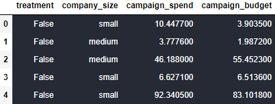
The data is composed of 15,474 advertisers with the following information:
- treatment: the variant to which the advertiser was assigned (Control or Treatment)
- company_size: Categorical variable representing company size, not company expenditure (Small, Medium and Large). It is included because companies of different sizes use the AdsSupreme ad platform in very different ways and may react differently to the new product.
- campaign_spend: Campaign expenditure during the experiment
- campaign_budget: Campaign budget during the experiment
As you can see in the following code snippets, fortunately our data has no null values, so we can skip any decisions regarding missing values and proceed to explore the data.
df.head()
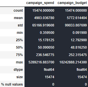
df_describe = df.describe()
df_describe.loc['dtype'] = df.dtypes
df_describe.loc['size'] = len(df)
df_describe.loc['% null values'] = df.isnull().sum()
df_describe
Exploratory Analysis
Categorical variables - Size of our clients
fig = plt.figure(figsize=(15,5))
vars_cat = ['treatment','company_size']
for i, var in enumerate(vars_cat):
    ax = plt.subplot(1,2,i+1)
    sns.countplot(df[var])
    plt.title("Count plot of " + var)

The treatment variable is evenly distributed in our data set, however, company_size is not evenly distributed in our 3 categories. More than half of the campaigns come from small companies, while medium-sized companies have the fewest campaigns. The variation in the company_size variable is important because, so far, our conclusions about the data will be influenced primarily by small firms, and because we do not know how well distributed the treatment variable is across firm sizes,
plt.figure(figsize=(24,8))
company_size = df['company_size'].unique()
for i, var in enumerate(company_size):
    plt.subplot(1,3,i+1)
    sns.countplot(df[df['company_size'] == var]['treatment'])
    plt.xlabel(var, fontsize=16)
    plt.title("Count plot of treatment for " + var + ' companies')

Looking at the distribution of treatment and control across different companiy sizes, we can see that customers were fairly well distributed across our old and new products.
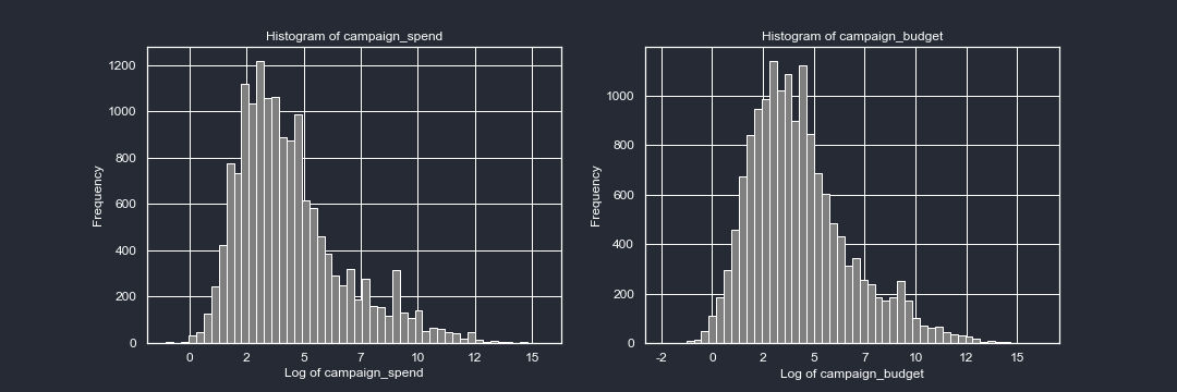
Continuous variables - Distribution of spending and budget
plt.figure(figsize=(15,5))
vars_quant = ['campaign_spend','campaign_budget']
for i, var in enumerate(vars_quant):
    ax = plt.subplot(1,2,i+1)
    ax.tick_params(axis='x', colors=fg_color, labelsize=12)    #setting up X-axis tick color to red
    ax.tick_params(axis='y', colors=fg_color, labelsize=12)  #setting up Y-axis tick color to black
    plt.hist(np.log(df[var]),bins = 50,color = 'grey')
    plt.title("Histogram of " + var, color = 'white')
    plt.xlabel('Log of ' + var, fontsize=12, color = 'white')
    plt.ylabel('Frequency', fontsize=12, color='white')
    plt.gca().xaxis.set_major_formatter(mticker.FormatStrFormatter('%d'))
plt.figure(figsize=(15,5))
vars_quant = ['campaign_spend','campaign_budget']
for i, var in enumerate(vars_quant):
    ax = plt.subplot(1,2,i+1)
    ax.tick_params(axis='x', colors=fg_color, labelsize=12)    #setting up X-axis tick color to red
    ax.tick_params(axis='y', colors=fg_color, labelsize=12)  #setting up Y-axis tick color to black
    sns.boxplot(x=np.log(df[var]))
    plt.title("Boxplot of " + var, color = 'white')
    plt.xlabel('Log of ' + var, fontsize=12, color = 'white')
    plt.gca().xaxis.set_major_formatter(mticker.FormatStrFormatter('%d'))
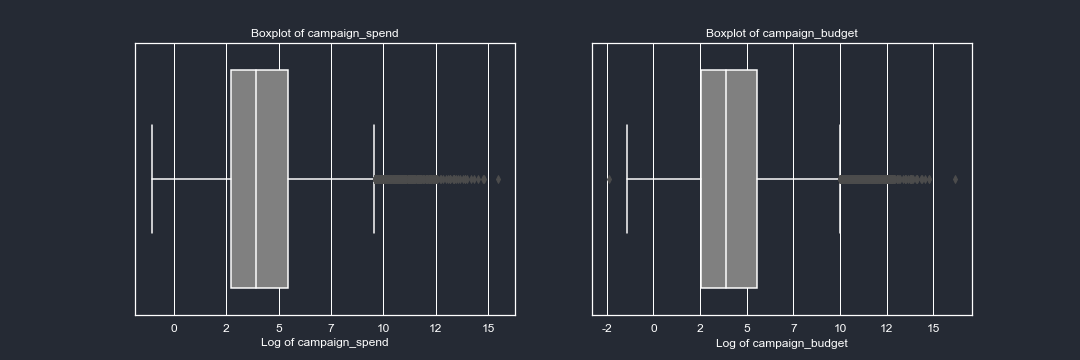
The spending and budget of the clients are skewed-right. This is not surprising since our clients are mostly small businesses. The level of skewedness is such that even applying a log function to the variables the shape of the curves are skewed to the right. It will be important to keep in mind that a couple of clients are the ones contributing the most to the spending in our platform. Let’s look at some descriptive stats of our data:
pd.options.display.float_format = '{:,.2f}'.format
for i in ['campaign_spend','campaign_budget']:
    print('Statistics for ' + i)
    print(df[i].describe())
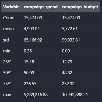
The mean is about 100 times bigger than the median for both spending and budget. This is not surprising when we compare the different percentiles with the maximum spending and budget made for a single campaign. It is important to keep in mind the level of skewness when defining the kind of test we are gonna implement and what exactly we want to compare between variants (Mean vs Median)
A similar analysis can be performed by company size. To avoid the overhead of content in the post, I will skip deeper exploration, but the steps are not different to what we have already done